Looking at the archives for various blogs brings up an interesting topic presented originally by Stale Gum.
The topic was, what would you do to fix Topps flagship? The only rule being that you have to keep the price to $2> per pack (before taxes).
This was shortly after 2011 Topps Series One had been released. Apparently everyone had opinions on the set (before we would all realize just how much worse flagship would become), and this one presented people with an opportunity to give more of them.
I'm a good seven years late but with 2018 Topps set to hit the shelves in two days I figure I'd put in my two cents. If your blog wasn't around in 2011, I'd recommend you chime in too.
Step 1: More Players
I know that a few other bloggers suggested this as well, and I'll suggest it too since it's a good idea.

It appears that between Series 1, 2 and Update, there's a total of 990 base cards (give or take). That's all fine and good until you realize that most of the Update checklist is garbage (stupid ASG cards) and not every player receives a card. Some no name on the Rays could carve out a 10 year career as a solid bench guy and they might get like 2-3 flagship cards tops (no pun intended) during that entire time. Well unspectacular, insignificant, forgettable teams like the Rays need cards too, I say bloat the checklist to four digit totals so all 750+ players can be properly represented between the three sets. Or as close as possible considering that some individuals may not have contract agreements with Topps in place. Just make the teams as close to equally represented in the base sets as you can, make the All Star Game cards short prints, and go ham with the favoritism all you want with the SSPs/SSSPs/SSSSPs/SSSSSPs etc...
Step 2: Bring Back Retail-Exclusive Parallels
When collectors talk about parallels, they often demand less of them. But in my case I want certain ones brought back.

Up until a few years ago you could find exclusive parallels at retail stores like Target (red), Walmart (blue) and Toys R us (purple). The first two stores have since dropped the retail only parallels (apparently they prefer exclusive products now) and with Toys R Us declaring bankruptcy I think the purple parallels are going to go bye-bye soon. Scratch that, I think they're gone given how I've seen jack regarding 2017 Update's purple parallels. Retail shoppers still get things like exclusive retail only inserts or those manufactured relics that come in blasters but they all suck donkey balls. I would much rather see a return of the colorful borders seeded at like one per pack or something.


And while we're at it, bring back the retail only format of the black parallels and throwback parallels too and print more of them. None of this serial numbered to 66 or 99 crap.
Step 3: More Than Just Players
When I said I wanted to inflate the checklist to the 1000's, I meant it. I mean why stop at just representing all 30 teams equally? Why not also focus on the managers, coaches and front office personnel? I'd love to get cards of key people like the manager, GM, the President of Baseball Ops, the shadow GM's with fancy titles, the director of player development, roving instructors, etc... In an age where we have access to so much information, knowing who exactly is running the show has never been easier (and important).

Although to be fair these might be better served as inserts. Either way I still think it'd be neat to have cards of in charge of making lineups and in charge of creating teams that can make lineups in the first place.
That said just keep it to people actually involved with the baseball aspects of the team. No one wants "anonymous executives."
Step 4: Different Photos From Opening Day/Team Sets/Topps Chrome/Topps Chrome Update
This is a pretty common opinion. It's no secret that Topps tends to just rehash the same images over and over again for Opening Day, Flagship, the team sets, Topps Chrome and occasionally Topps Chrome Update. So I recommend that they use different pictures for all of them. Would be kind of neat to see different photographs used on basically the same design in a context that DOESN'T involve shortprints.
Step 5: Stop With The Inserts That Have Blank Spaces
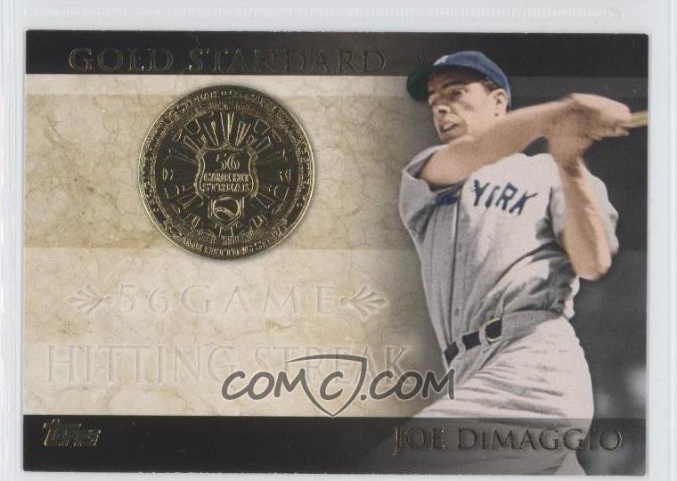 |
| From COMC |
Back in 2012 I remember a lot of the inserts pissing me off because there was a whole lot of unnecessary space left open. I think the idea was so the card could look nice when a sticker autograph (or an actual on-card autograph) was applied to it, but that doesn't excuse how ugly the unstickered cards (which outnumber the autographed cards BTW) look.
 |
| From COMC |
Plus it's not even a card worth getting ink on. I mean what kind of person is going to want to get a turd like this signed? If you're a normal person with even the slightest bit of taste you can find loads of cards better than these lousy inserts to either get ink or have a sticker autograph on. Admittedly I haven't kept up with flagship since like 2013 so I'm not sure if these kinds of inserts are around anymore, but if they're still around I hope these needlessly empty cards go away.
Step 6: Revamp The Boxed Complete Sets
This is straying from the topic at hand but it's kind of related. Have you ever seen those $50 boxed complete sets of flagship at your local big box store or LCS? Well if you have you're probably like me in thinking they could use some work. Starting with how they only do Series 1 and 2. I've long held the opinion that if Topps is just going to package the entire flagship set into one entity for lazy people then they might as well include Update.
Recently Topps has started opting for relics. Which is nice, but unless it's a patch or something limited to like five copies it's still not worth it.
So here were the best ideas I could come up with to "help" Topps flagship. The fact that these were the best of the best should indicate just how horrible the rest of them were.
As always thanks for stopping by and take care :).


